تاريخ الرياضيات

الاعداد و نظريتها
تاريخ التحليل
تار يخ الجبر
الهندسة و التبلوجي
الرياضيات في الحضارات المختلفة
العربية
اليونانية
البابلية
الصينية
المايا
المصرية
الهندية
الرياضيات المتقطعة
المنطق
اسس الرياضيات
فلسفة الرياضيات
مواضيع عامة في المنطق
الجبر
الجبر الخطي
الجبر المجرد
الجبر البولياني
مواضيع عامة في الجبر
الضبابية
نظرية المجموعات
نظرية الزمر
نظرية الحلقات والحقول
نظرية الاعداد
نظرية الفئات
حساب المتجهات
المتتاليات-المتسلسلات
المصفوفات و نظريتها
المثلثات
الهندسة
الهندسة المستوية
الهندسة غير المستوية
مواضيع عامة في الهندسة
التفاضل و التكامل
المعادلات التفاضلية و التكاملية
معادلات تفاضلية
معادلات تكاملية
مواضيع عامة في المعادلات
التحليل
التحليل العددي
التحليل العقدي
التحليل الدالي
مواضيع عامة في التحليل
التحليل الحقيقي
التبلوجيا
نظرية الالعاب
الاحتمالات و الاحصاء
نظرية التحكم
بحوث العمليات
نظرية الكم
الشفرات
الرياضيات التطبيقية
نظريات ومبرهنات
علماء الرياضيات
500AD
500-1499
1000to1499
1500to1599
1600to1649
1650to1699
1700to1749
1750to1779
1780to1799
1800to1819
1820to1829
1830to1839
1840to1849
1850to1859
1860to1864
1865to1869
1870to1874
1875to1879
1880to1884
1885to1889
1890to1894
1895to1899
1900to1904
1905to1909
1910to1914
1915to1919
1920to1924
1925to1929
1930to1939
1940to the present
علماء الرياضيات
الرياضيات في العلوم الاخرى
بحوث و اطاريح جامعية
هل تعلم
طرائق التدريس
الرياضيات العامة
نظرية البيان

Scatter Diagram
 المؤلف:
Moore, D. S. and McCabe G. P
المؤلف:
Moore, D. S. and McCabe G. P
 المصدر:
Introduction to the Practice of Statistics. New York: W. H. Freeman, 1999.
المصدر:
Introduction to the Practice of Statistics. New York: W. H. Freeman, 1999.
 الجزء والصفحة:
...
الجزء والصفحة:
...
 3-10-2021
 1483
1483


+
-
20
Scatter Diagram
A scatter diagram, also called a scatterplot or a scatter plot, is a visualization of the relationship between two variables measured on the same set of individuals. Scatter diagrams for lists of data  ,
,  , ... can be generated with the Wolfram Language using ListPlot[
{" src="https://mathworld.wolfram.com/images/equations/ScatterDiagram/Inline3.gif" style="height:15px; width:5px" />
{" src="https://mathworld.wolfram.com/images/equations/ScatterDiagram/Inline4.gif" style="height:15px; width:5px" />x1, y1
}" src="https://mathworld.wolfram.com/images/equations/ScatterDiagram/Inline5.gif" style="height:15px; width:5px" />,
{" src="https://mathworld.wolfram.com/images/equations/ScatterDiagram/Inline6.gif" style="height:15px; width:5px" />x2, y2
}" src="https://mathworld.wolfram.com/images/equations/ScatterDiagram/Inline7.gif" style="height:15px; width:5px" />, ...
}" src="https://mathworld.wolfram.com/images/equations/ScatterDiagram/Inline8.gif" style="height:15px; width:5px" />].

A scatter diagram makes it particularly easy to spot trends and correlations between the two variables. For example, the scatter diagram illustrated above plots wine consumption (in liters of alcohol from wine per person per year) against deaths from heart disease (in deaths per 100,000 people) for 19 developed nations (Moore and McCabe 1999, Ex. 2.5)
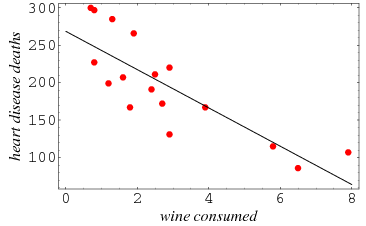
There is clearly and inverse relationship between these two variables. Once such a relationship has been found, linear regression can be used to find curves of best fit. The graph above shows the same scatter diagram as above together with a line of best fit.
REFERENCES:
Moore, D. S. and McCabe G. P. Introduction to the Practice of Statistics. New York: W. H. Freeman, 1999.
 الاكثر قراءة في الرياضيات التطبيقية
 اخر الاخبار
اخبار العتبة العباسية المقدسة
الآخبار الصحية


 قسم الشؤون الفكرية يصدر كتاباً يوثق تاريخ السدانة في العتبة العباسية المقدسة
 "المهمة".. إصدار قصصي يوثّق القصص الفائزة في مسابقة فتوى الدفاع المقدسة للقصة القصيرة
 (نوافذ).. إصدار أدبي يوثق القصص الفائزة في مسابقة الإمام العسكري (عليه السلام)