
تاريخ الرياضيات

الاعداد و نظريتها

تاريخ التحليل

تار يخ الجبر

الهندسة و التبلوجي


الرياضيات في الحضارات المختلفة

العربية

اليونانية

البابلية

الصينية

المايا

المصرية

الهندية


الرياضيات المتقطعة

المنطق

اسس الرياضيات

فلسفة الرياضيات

مواضيع عامة في المنطق


الجبر

الجبر الخطي

الجبر المجرد

الجبر البولياني

مواضيع عامة في الجبر

الضبابية

نظرية المجموعات

نظرية الزمر

نظرية الحلقات والحقول

نظرية الاعداد

نظرية الفئات

حساب المتجهات

المتتاليات-المتسلسلات

المصفوفات و نظريتها

المثلثات


الهندسة

الهندسة المستوية

الهندسة غير المستوية

مواضيع عامة في الهندسة

التفاضل و التكامل


المعادلات التفاضلية و التكاملية

معادلات تفاضلية

معادلات تكاملية

مواضيع عامة في المعادلات


التحليل

التحليل العددي

التحليل العقدي

التحليل الدالي

مواضيع عامة في التحليل

التحليل الحقيقي

التبلوجيا

نظرية الالعاب

الاحتمالات و الاحصاء

نظرية التحكم

بحوث العمليات

نظرية الكم

الشفرات

الرياضيات التطبيقية

نظريات ومبرهنات


علماء الرياضيات

500AD

500-1499

1000to1499

1500to1599

1600to1649

1650to1699

1700to1749

1750to1779

1780to1799

1800to1819

1820to1829

1830to1839

1840to1849

1850to1859

1860to1864

1865to1869

1870to1874

1875to1879

1880to1884

1885to1889

1890to1894

1895to1899

1900to1904

1905to1909

1910to1914

1915to1919

1920to1924

1925to1929

1930to1939

1940to the present

علماء الرياضيات

الرياضيات في العلوم الاخرى

بحوث و اطاريح جامعية

هل تعلم

طرائق التدريس

الرياضيات العامة

نظرية البيان
The normal curve
المؤلف:
Tony Crilly
المصدر:
50 mathematical ideas you really need to know
الجزء والصفحة:
202-206
28-2-2016
2646
The ‘normal’ curve plays a pivotal role in statistics. It has been called the equivalent of the straight line in mathematics. It certainly has important mathematical properties but if we set to work analysing a block of raw data we would rarely find that it followed a normal curve exactly.
The normal curve is prescribed by a specific mathematical formula which creates a bell-shaped curve; a curve with one hump and which tails away on either side. The significance of the normal curve lies less in nature and more in theory, and in this it has a long pedigree. In 1733 Abraham de Moivre, a French Huguenot who fled to England to escape religious persecution, introduced it in connection with his analysis of chance. Pierre Simon Laplace published results about it and Carl Friedrich Gauss used it in astronomy, where it is sometimes referred to as the Gaussian law of error.
Adolphe Quetelet used the normal curve in his sociological studies published in 1835, in which he measured the divergence from the ‘average man’ by the normal curve. In other experiments he measured the heights of French conscripts and the chest measurements of Scottish soldiers and assumed these followed the normal curve. In those days there was a strong belief that most phenomena were ‘normal’ in this sense.
The cocktail party
Let’s suppose that Georgina went to a cocktail party and the host, Sebastian, asked her if she had come far? She realized afterwards it was a very useful question for cocktail parties – it applies to everyone and invites a response. It is not taxing and it starts the ball rolling if conversation is difficult.
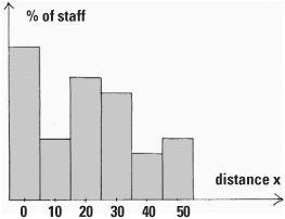
The next day, slightly hungover, Georgina travelled to the office wondering if her colleagues had come far to work. In the staff canteen she learned that some lived around the corner and some lived 50 miles away – there was a great deal of variability. She took advantage of the fact that she was the Human Resources Manager of a very large company to tack a question on the end of her annual employee questionnaire: ‘how far have you travelled to work today?’ She wanted to work out the average distance of travel of the company’s staff. When Georgina drew a histogram of results the distribution showed no particular form, but at least she could calculate the average distance travelled.

Georgina’s histogram of distance travelled by her colleagues to work
This average turned out to be 20 miles. Mathematicians denote this by the Greek letter mu, written μ, and so here μ, = 20. The variability in the population is denoted by the Greek letter sigma, written σ, which is sometimes called the standard deviation. If the standard deviation is small the data is close together and has little variability, but if it is large, the data is spread out. The company’s marketing analyst, who had trained as a statistician, showed Georgina that she might have got around the same value of 20 by sampling. There was no need to ask all the employees. This estimation technique depends on the Central Limit Theorem.
Take a random sample of staff from all of the company’s workforce. The larger the sample the better, but 30 employees will do nicely. In selecting this sample at random it is likely there will be people who live around the corner and some long-distance travellers as well. When we calculate the average distance for our sample, the effect of the longer distances will average out the shorter distances. Mathematicians write the average of the sample as  , which is read as ‘x bar’. In Georgina’s case, it is most likely that the value of
  will be near 20, the average of the population. Though it is certainly possible, it is unlikely that the average of the sample will be very small or very large.

How the sample average is distributed
The Central Limit Theorem is one reason why the normal curve is important to statisticians. It states that the actual distribution of the sample averages  approximates to a normal curve whatever the distribution of x. What does this mean? In Georgina’s case, x represents the distance from the workplace and
  is the average of a sample. The distribution of x in Georgina’s histogram is nothing like a bell-shaped curve, but the distribution of
  is, and it is centred on μ = 20.
This is why we can use the average of a sample  as an estimate of the population average μ. The variability of the sample averages
  is an added bonus. If the variability of the x values is the standard deviation σ, the variability of
  is σ/√n where n is the size of the sample we select. The larger the sample size, the narrower will be the normal curve, and the better will be the estimate of μ.
Other normal curves
Let’s do a simple experiment. We’ll toss a coin four times. The chance of throwing a head each time is p = ½. The result for the four throws can be recorded using H for heads and T for tails, arranged in the order in which they occur. Altogether there are 16 possible outcomes. For example, we might obtain three heads in the outcome THHH. There are in fact four possible outcomes giving three heads (the others are HTHH, HHTH, HHHT) so the probability of three heads is 4/16 = 0.25.
With a small number of throws, the probabilities are easily calculated and placed in a table, and we can also calculate how the probabilities are distributed. The number of combinations row can be found from Pascal’s triangle :

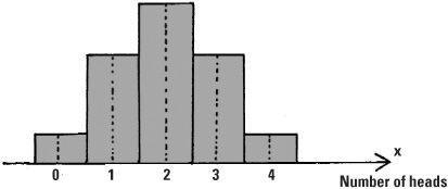
This is called a binomial distribution of probabilities, which occurs where there are two possible outcomes (here a head or a tail). These probabilities may be represented by a diagram in which both the heights and areas describe them.

The number of heads in four tosses of a coin, according to the binomial distribution
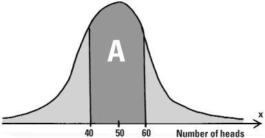
Tossing the coin four times is a bit restrictive. What happens if we throw it a large number, say 100, times? The binomial distribution of probabilities can be applied where n = 100, but it can usefully be approximated by the normal bell-shaped curve with mean μ = 50 (as we would expect 50 heads when tossing a coin 100 times) and variability (standard deviation) of σ = 5. This is what de Moivre discovered in the 16th century.

Distribution of the probability for the number of heads in 100 throws of a coin
For large values of n, the variable x which measures the number of successes fits the normal curve increasingly well. The larger the value of n the better the approximation and tossing the coin 100 times qualifies as large. Now let’s say we want to know the probability of throwing between 40 and 60 heads. The area A shows the region we’re interested in and gives us the probability of tossing between 40 and 60 heads which we write as prob(40 (≤x ≤ 60). To find the actual numerical value we need to use precalculated mathematical tables, and once this has been done, we find prob(40 ≤ (x ≤ 60) = 0.9545. This shows that getting between 40 and 60 heads in 100 tosses of a coin is 95.45%, which means that this is very likely.
The area left over is 1 – 0.9545 which is a mere 0.0455. As the normal curve is symmetric about its middle, half of this will give the probability of getting more than 60 heads in a 100 tosses of the coin. This is just 2.275% and represents a very slim chance indeed. If you visit Las Vegas this would be a bet to leave well alone.
the condensed idea
The ubiquitous bell-shaped curve

 الاكثر قراءة في هل تعلم
 اخر الاخبار
اخبار العتبة العباسية المقدسة

الآخبار الصحية


 قسم الشؤون الفكرية يصدر كتاباً يوثق تاريخ السدانة في العتبة العباسية المقدسة
 "المهمة".. إصدار قصصي يوثّق القصص الفائزة في مسابقة فتوى الدفاع المقدسة للقصة القصيرة
 (نوافذ).. إصدار أدبي يوثق القصص الفائزة في مسابقة الإمام العسكري (عليه السلام)


